Hello friends, happy Monday!
As mentioned in last week’s update, we’re now focusing on laying the foundation for desktop and mobile apps. During the past week, we made good progress on offline support, and we now have a plan to make mobile better. By the way, we’re still looking for feedback on the date feature. Let us know what you think before it’s too late!
Bug fixes
- Fixed icon of uploaded files. It used to be like those Unicode characters that your computer can’t display.
- On Android, when you edit an item and tap on the “more” option (three vertical dots), the continued menu used to appear at top of page, which is the wrong position. Now that’s fixed.
- Last week we improved the experience of keyboard users by auto-focusing on the first item when you switch to a new document. This is very annoying on mobile though – just fixed that.
Improvements
- Did some performance improvements on mobile. Everything should be more responsive now.
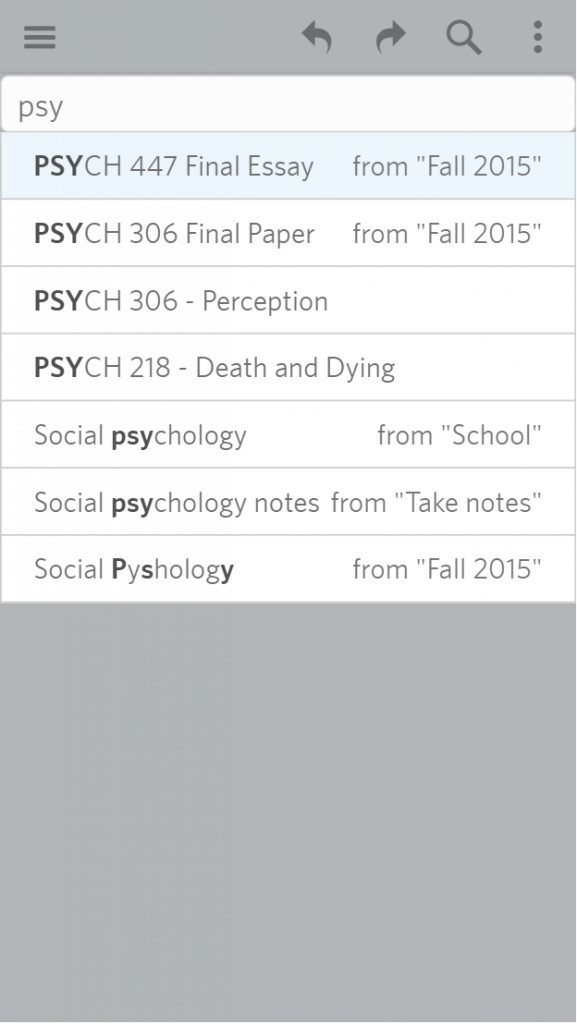
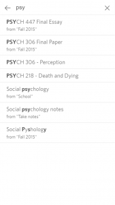
- Made the document finder prettier to match the other parts of the mobile web:
That’s it for this week, have a great week everyone!

